Before Pacific Data Images (PDI) was bought by DreamWorks and became one of the powerhouses of CG animation with Antz and then Shrek, it was affectionately known as ‘the morphing house.’ That reputation was firmly established with the studio’s work on the music video for Michael Jackson’s “Black or White”, which celebrates its 25th anniversary today.
In interviews with several key artists involved in the famous face transitions seen in the video, Cartoon Brew revisits how PDI’s morphing tech came to be, how it was used on “Black or White”, and how it launched an era of overuse of the visual effect.
‘That was morphing’
Jamie Dixon (visual effects supervisor, PDI): We got a call from Propaganda Films and they said they were doing this Michael Jackson project directed by John Landis, and in it they were trying to show that all races are the same and that people are fundamentally the same. And they had this sequence where there were going to be a bunch of faces that are transitioning from one to the other. We’d done that work before. That was morphing.
Tim Clawson (head of production, Propaganda Films): It was the first song off the new album from Michael. He hired us to do all the music videos from that album. Actually, with Michael you could never say ‘music video,’ you had to say ‘short film.’
Jamie Dixon: One of the inspirations was a music video from the 1980s called Cry by Godley and Creme. Here they basically had a bunch of faces that changed but they did it the hard way. They got the cameras to line up and they kept the features as lined up as best as possible but they were still doing dissolves between them.
Tim Clawson: We talked to Lol Creme about how they did that – they had no money so they didn’t really use visual effects. He said, ‘Well, if you line up the eyes, then you know the faces will all fit on top of each other. And you just have to make some very subtle adjustments.’
Carl Rosendahl (founder, PDI): We had opened PDI’s L.A. office in 1990 to do feature film work, but were still primarily producing commercials and some broadcast graphics. Our goal from the mid-’80s on was to build the studio to be able to produce our own fully animated feature films. We saw morphing as a great tool to help with film and commercial effects, and had built a tool that enabled us to do it faster and better than anyone else at the time. By the time “Black or White” came along we had already done quite a few commercials with it, and we thought that the video would show it off beautifully.
Thad Beier (R&D manager, PDI): The summer before we got the work for “Black or White,” we had to do some warping for a Plymouth Voyager minivan commercial and we had to design a tool to do it. So Jamie Dixon and I were sitting around one weekend and it was like, ‘Well, let’s see what we can do.’ So we tried probably twenty different things. We were trying to transition from one car to another to show the new version of the car.
Jamie Dixon: This commercial got out there and everybody loved it. It was a fresh new thing that nobody had ever seen before. So now we were on the map in terms of doing morphing, and the only other place that was doing anything with that at the time was ILM, which had done it in Willow first.
Shawn Neely (technical director, PDI): We were just ‘morphing’ still images at that point but the advancement was that one person could basically do the job that previously it would take an animator and shader and lighter, and a bunch of technical directors to work on – a whole 3D team.
Thad Beier: To do that Plymouth work we ended up drawing a line on this image and a line on that image that corresponded to the feature you wanted it to end up looking like. And we did that for a whole bunch of lines and came up with an algorithm so that we could warp one to the other to make all those lines correspond. And it worked pretty well. I couldn’t quite believe it.
Jamie Dixon: How did we come up with the name morphing? Well, somebody did an article on the car commercial and they asked, ‘What do you guys call this?’ And we came up with the word morphing at that point. ILM called their tool ‘morf’, but when the writer was asking about the car commercial article I said, ‘Well, m-o-r-p-h is how I would spell it.’
Thad Beier: On Willow they had used an algorithm that was far harder to do. Rather than just have a situation where the artist draws the things he or she wants to correspond to, they put up meshes over the whole screen, and people had to drag the meshes to correspond. That was infinitely harder and less precise. The nice thing about drawing individual lines is that you draw a few lines and you look at the morph, and you say, ‘Okay the lines don’t line up,’ so you draw a line over the eyes and then they line up, and you just keep on going and keep adding points or lines until you get everything to move the way you want.
Jamie Dixon: Before we started working on the “Black or White” video, we’d actually also bid on James Cameron’s Terminator 2. Boss Film had been approached by Jim’s company to bid on the transformations of the liquid metal character, the T-1000. And we were there doing this other project and they said, ‘Hey, do you guys know anything about this kind of thing? We thought we could try and figure out how to do that – this feature-based morphing – and the result was an almost parallel evolution with ILM in figuring out a way to do morphing. [ILM ultimately relied on a technique of model interpolation as well as more traditional morphing for the Terminator 2 T-1000 transitions].
Jamie Dixon: Once we were asked to do “Black or White”, we did some face tests. I remember we took a picture of Carl Rosendahl, and he had a kid who was four or five years old and we took a picture of him too and we morphed Carl’s kid into Carl. It was kind of a revelation. You literally could see this kid growing up right in front of your eyes. It had a weirdly strong emotional effect on you when you would see that.
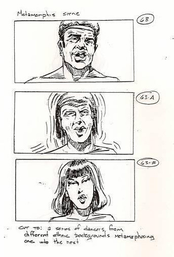
Tim Clawson: The key to the final result was how it was shot, which was a lot about lining up the eyes as perfectly as possible. We had this sort of glass in front of the camera where we could put the eyes and make sure the eyes were always in the same place of every single person in the frame.
Jamie Dixon: We had a setup that was kind of clinical. The camera was really close to them with a simple gray backdrop behind them. The idea was we would shoot a dozen people dancing to this song, and we designed what we thought was a simple dance move where they would bob their head twice and then they looked to the left and then back to camera and then to the left again and sing along. As a computer graphics person we’re always very interested in precision and repeatability and to us that seemed like the easiest thing in the world, but it was next to impossible to get these guys to be able to do it right.
I had a great time working with John Landis on this, and after a while he said, ‘Why don’t you direct the people to do those moves?,’ because we couldn’t quite get it right. And I remember I specifically went up and I was standing with nineteen-year-old Tyra Banks, and I said, ‘Okay, when you do this move, when you come back and you do this nod, you have to be lower.’ And she said, ‘How low can I go?’ And of course the whole set was, like, ‘Woooo’.
Tim Clawson: While we were filming we could see that the morphing sequence was going to fit the song so well. Not only the rhythm of the song itself – you’re black, you’re white, you’re black, you’re white, but also the message of the song. So just all those things came together to really make that a very special piece. Visual effects are best right when everything comes together, and where the idea of what you’re trying to do transcends the final shots. The visual effects are just simply the execution and not the idea themselves.
Jamie Dixon: Later while we were working on the sequence, I had to go to a meeting with John Landis while they were still shooting and I rode my motorcycle out to have this meeting at a power plant. And when he saw my bike he said, ‘Hey, you should be in this.’ There was a company called Stunts Unlimited and they showed me where I should ride. And I made it into the final video. And my payment for that was I got a Stunts Unlimited hat, which I was very proud of.
Jamie Dixon: The editor put together an edit of the whole piece using dissolves, and the idea was to get the dissolves as close as possible, in other words, to get the people moving their head at roughly the same time and nodding their head.
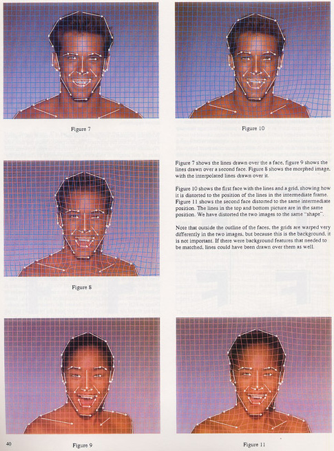
Thad Beier: I had moved over to Silicon Graphics by the time PDI was working on “Black or White.” But they used the software we had developed. For every face that was transformed from one to the next, they broke the image up into the face, the hair, and everything else was broken up to different layers, morphed separately and then composited back together. Most people who were doing morphing just morphed one image into the other. By breaking it up into different layers like that you could get a lot more control.
Jamie Dixon: At a basic level it’s nothing more than a dissolve. What you’re adding to that dissolve is that you’re keeping the features of the image aligned as they turn from one to another. So in other words if I was morphing from one eye to another eye, if I keep those eyes lined up as one goes to the other it looks to you like one’s turning into the other rather than one’s dissolving off and the other’s dissolving on.
Shawn Neely: I developed some rotoscoping tools that would allow us to pull soft-edged mattes. So we’d separate the person’s hair and matte that out separately from the face or the rest of the body. We’d end up with different parts of the person that we could warp and morph those independently and then bring them back together. There was also interesting stuff we did about changing the timing of the distortion part of the morph, or the dissolve part of the morph. So it didn’t happen all uniformly. That really gave it more of an artistic kick.
Thad Beier: You could adjust the timing for how the line moves from one image to the other, so if you know you want the nose to move quicker or slower than the rest of the face you could adjust that timing. You could also adjust the timing that the area around that nose dissolved from one image to the other.
Barbara Meier (animator, PDI): I worked on the first seven transitions. Amongst those were some challenging hair styles. The second morph, from the thin black woman to the redhead, was very challenging with regard to hair. The wavy red hair appears in literally three frames like it is falling down from being tied back. We tried a lot of different looks for this, but most of them looked like the hair was fading in like in a traditional dissolve. Having it fall down made it look like the hair was physically falling out of a pulled-back style. In the reverse case, the guys with dreads transitions to the Indian woman. In this case, we had to get his swinging dreads to transition to her pulled back hair. We used his fast head turn as motivation to suck the dreads in close to the face. The dreads also swung across the face which helped distract from the transition between his facial hair and her lack of it.
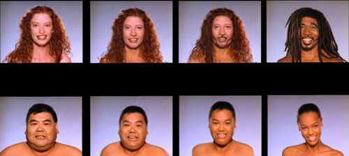
Jamie Dixon: We had developed a whole vocabulary of how to deal with this – how to talk about each one of the pieces. So one of the guys, we named him ‘Steve’, I don’t know if his name was actually Steve. There was one guy we named him ‘Glenn,’ and then I remember another guy we called ‘Dancer.’ So we were like, ‘Hey, how’s Dancer to Steve going?’
Tim Clawson: What you realize is that the distance between most people’s eyes is pretty much the same distance. And so it was kind of an ocular, an ocular trick rather than a visual effect in some ways. Because you could literally paste people’s heads right on top of each other and they fit very well. So then it was just all about what was going on with the hair and any other pieces that you could clean up.
Jamie Dixon: If you think about a generic face, most people have two eyes, a nose, and a mouth. Those are fairly easy features to keep lined up as you transition from one to the other. The challenge that we found all of a sudden, and we hadn’t really been anticipating this, is we had one guy with a mustache, we had a guy with a goatee, we had somebody with long hair, somebody with short hair, all of those kind of things.
Barbara Meier: Because the software was written in-house by Thad Beier and Shawn Neely, we were able to ask for new features and literally get them within a matter of hours or days. In order to make the best transitions, we asked those guys for a lot of new things! As far as software goes, the process was all 2D, working with video sequences, so not difficult to learn. But with any tool, it took a while to figure out just how far it could be pushed, as well as its limitations.
Jamie Dixon: There were a lot of transitions that happened in that sequence that were basically custom designed. So with the guy with the goatee, for instance, we found that if we wiped that on as if it was, that was a more satisfactory transition than just having the, kind of a weird dissolve where it would come out of nowhere. Our guiding principle was – I mean, this is actually something that kind of applies to all of visual effects – but one of the guiding principles is that we wanted to make it look like it was happening in the picture as opposed to on the picture. So we didn’t want to make it look like there was a bunch of pictures changing from one to another. We wanted to make it look like we were taking a picture of something that was transforming from one to the other.
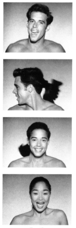
Barbara Meier: Our main weapon was to vary the timing across facial and hair features. They eyes might transition first, so you have all person A except for person B’s eyes for a 1-2 seconds. Since everyone was human – not a given in the morphing world with all the transitions from person to animal as in a panther turning into MJ, or animals to cars in a slew of TV ads – we could rely on similar features: eyes, nose, mouth. Hair and skin color transitions were more challenging. In some transitions, the intermediate skin color was not a color naturally found in humans and was therefore unappealing. We didn’t want to introduce unnatural or unattractive ‘in-between’ people, so if we came across something like that, we just made the transition very quick.
Jamie Dixon: Not everyone made the cut. I think we probably shot about twice as many as we ended up using. And then we had been in touch with Propaganda and they told us that their tracking was showing that literally five hundred million people were going to tune in and watch the premiere of this. I’m telling you, having half a billion people watching some piece of art that you’re doing is a tremendous motivator to get it right.
Jamie Dixon: Everybody who worked on it got together and we watched the premiere and of course it was super exciting. It was so highly anticipated that they played the video, and then as soon as it was done they played it again. And then we had a party with Propaganda and all the people who were in the video. Which was funny because we were just so intimately familiar with these people, and I remember walking into that thing and it’s like, ‘Oh my god Glenn, how are you doing? Oh Dancer, hey, how are you doing, man?’ And they looked at me and they’re like, ‘Who the fuck are you?’ We had spent three months inspecting and curating the very detailed features of their faces.
Barbara Meier: Although we knew MJ was a megastar, I really had no idea the impact the video would make. Some of the immediate reaction to the final four minutes of the original video overshadowed the rest of the extravagant piece. But I’m most amazed at how the morphing sequence is the part of the video that people remember most. It wasn’t a new technique, but this was the most widely shown and forward use of it. I think the idea of creating a third person between two existing ones intrigued a lot of people and the physicality of this new person reached a new bar.
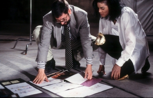
Tim Clawson: We used to have a joke where we would say the dirty little secret of music videos is if you have a great song and you put mediocre images up against it people think you made a great video. But with Michael we always had a great song, and fortunately he worked with top film makers and directors, and with a great song came a lot of really interesting ideas.
Carl Rosendahl: I remember that we thought that the music video would be the pinnacle of using morphing as an effect and the technique would then recede to being just another tool. We were really wrong about that. The attention the video got was enormous, as all Michael Jackson videos were at the time, and it created an intense interest in using the effect in all sorts of new ways. For the year after that we became known as the morphing house because we did so much of it. That was great from the standpoint that it was very profitable work for us, but it also detracted from our primary focus of building all the other tools and skill sets we needed to do fully animated features. We had also just started our Character Animation group in late 1990, and we were working hard to push that part of our business.
Jamie Dixon: We ended up getting involved in a whole bunch of Michael Jackson projects. We did a couple of Pepsi commercials with him that Joe Pytka directed. And we did some kind of simple morphing in some of those, and some CGI, just a bunch of other things. And then through Propaganda we ended up doing a number of music videos as well including Jam and Remember the Time.
Carl Rosendahl: The video garnered a lot of attention for everyone involved, and no doubt gave us additional credibility in the film and commercial industries. We worked on more MJ videos after that and did other jobs for John Landis. We were already doing lots of commercial work, but that created a big demand for morphing effects which I think slowed us down in other areas. We were able to use those profits to push in other development though.
Jamie Dixon: I remember saying that morphing earned PDI $10 million dollars at the time because we got all this work that was literally directly related to that. And the Michael Jackson video really was kind of the brightest beacon that we had in that category of work.
Shawn Neely: We had a couple of years of kind of printing money, it was great. We used a lot of that to fund expansion to do more live-action film work and get the character animation group together to make some pitches for eventually doing feature animation work. We ended up doing Antz and Shrek and of course everything that came afterwards.
Jamie Dixon: Morphing actually became a very important tool in our arsenal, just the fact that you could turn one thing into another means you could go fix little things. I used morphing in some of the early wire removals that we did where you were trying to remove something from a frame and you would end up with some bad glitch. And I discovered that you could just go to the frame before the bad glitch, you could go to the frame after the bad glitch, and you could just morph between them and no one would know.
Carl Rosendahl: We were able to do a better effect much faster than anyone else, and we were able to charge a lot for it. We kept it an internal secret for quite awhile and then as word was getting out Thad and Shawn published the technique at SIGGRAPH in 1992.
Shawn Neely: Our SIGGRAPH 1992 paper was very different from the other work that Tom Brigham had done at MIT and that was done at ILM where warping grids of points was used. Instead, Thad’s algorithm was more based on a skeleton. So we would actually draw out sort of a shape and distort the images based on outlines or on a skeletal shape. [Neely also notes that the 1974 animated short, Hunger, by Peter Foldès, which was omitted as a reference from the original SIGGRAPH paper, was an influence in how PDI’s morphing would look].
Thad Beier: One of the great things about that SIGGRAPH paper was that it was very straightforward. A lot of colleges were teaching people computer graphics and they’d get the students to implement what we wrote. It was relatively easy to do, and it gave the programmer or the student the ability to have a built-in creative tool pretty quickly and they were able to play with it, and I think thousands of students did do this.
Barbara Meier: Our use of morphing in the sequence was full frame, front and center, with real humans, not a horror movie trick involving a beast in a dark environment. The sequence made morph a household word. I remember going to the cast and crew premier of Star Trek VI just a month or so after “Black or White” came out and someone in the audience yelled out ‘MORPHING!’ during the movie! Of all the pieces I worked on in my career, this is the one that most people have seen and associate with my production career.
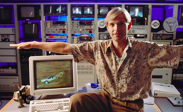
Jamie Dixon: Not long after the “Black or White” video, everybody was like, ‘Oh I can do that.’ And they would do it all wrong, at least from my perspective. And it was frustrating, and definitely after a while everybody got tired of it.
Thad Beier: The software Elastic Reality used pretty much exactly the same or a slight refinement of what I had done. You could draw closed regions and the morph would only work within those regions. It was a slight change in the idea, but very, very similar.
Shawn Neely: I remember being really moved the first few times that I saw good morphs, but there was a period where I felt like the market was saturated with bad morphs. It just became such a commodity thing and some of the artistic aspects, like varying the timing and breaking things down into elements, some of those things were kind of lost. And so there definitely were a bunch of bad morphs that made me cringe a year or two later that I would see on TV.
Jamie Dixon: You can make a violin and somebody hears an amazing violinist and all of a sudden everybody thinks they can play a violin. And most people who pick up a violin aren’t very good at it. I’m not saying that we were concert violinists in our use of morphing, but we were very careful and we were very attentive to making high quality, beautifully seamless transitions from one thing to another.
#DANGEROUS25
SOURCE: Cartoon Brew


